
What??! You're moving?
 |
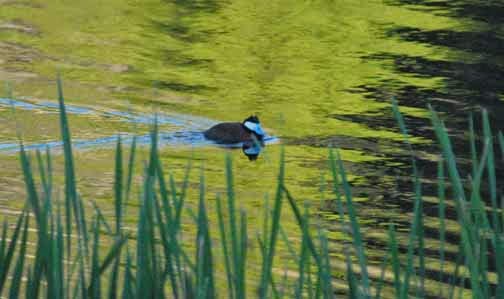
| Elk Surprise by Shirl Ireland |
This blogging platform has not been liking my current browser. That's what the error messages say anyway. So I've been trying out a new blog spot and web site platform specifically set up for fine artists. Now it's time to 'flip the switch'. A new blog for a new year.
To continue to follow along, check out my new blog now located at www.shirlireland.com/blog
I have a new website there (www.shirlireland.com) devoted to painting and classes that you can look over, too.
If I get the browser problem figured out, I may 'resuscitate' this blog address in the future. But I'd post that info on the new blog if/when that time comes. So for now....
Hope you like the changes. I'd love to hear your thoughts about the new site when you 'stop by'....
What the caterpillar calls the end of the world, the master calls a butterfly.
We delight in the beauty of the butterfly but rarely admit the changes it has gone through to achieve that beauty.
Enjoy the change of 2015....
Happy New Year!


